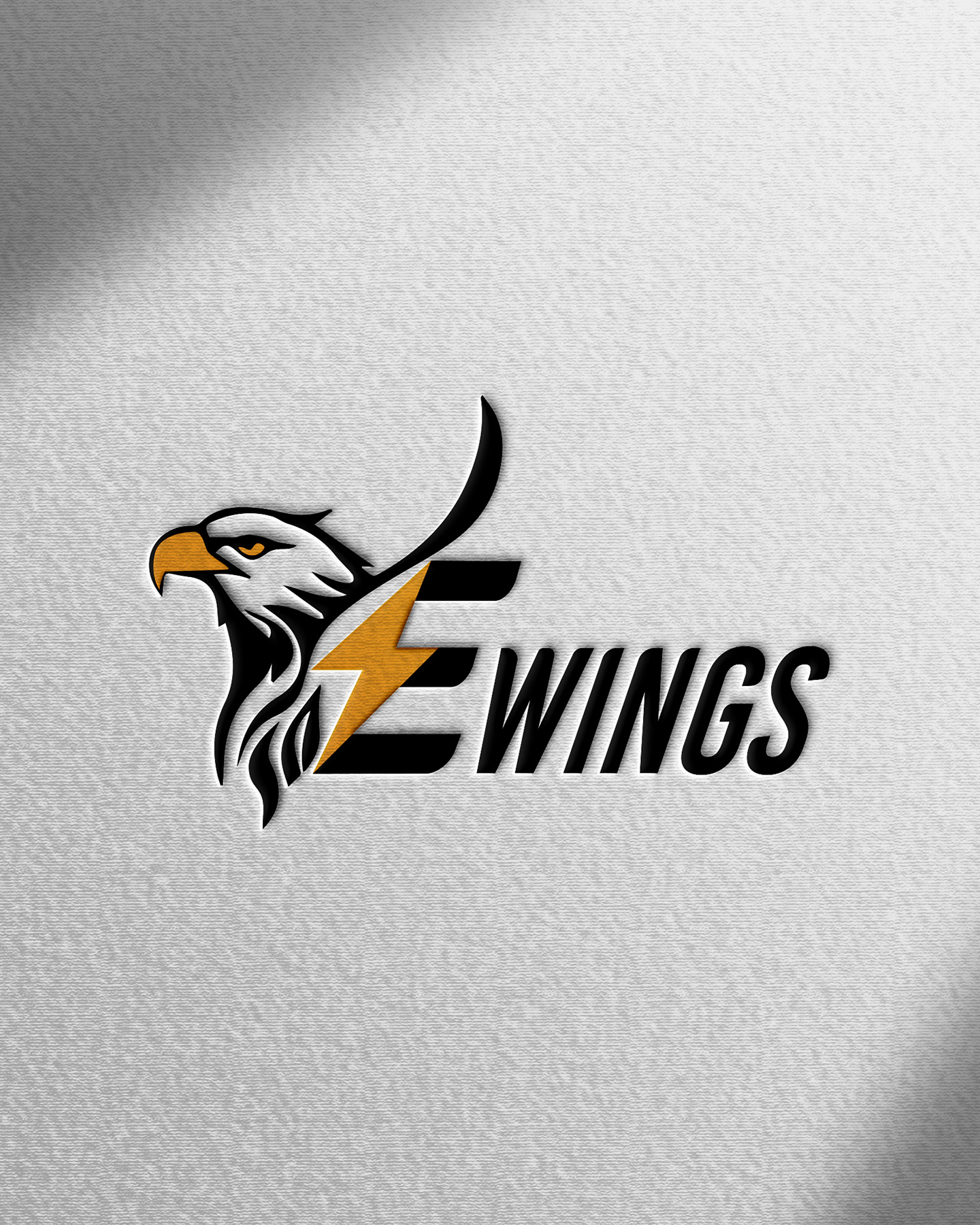
E - Wings
Strategic Impact & Outcomes
Project: EWINGS – Brand Identity Design
Overview:
A high-energy, dynamic visual identity designed for EWINGS. The objective was to craft an aggressive, forward-moving brand image that conveys speed, power, precision, and a fierce competitive edge.
Design Concept:
The logo design features a meticulously detailed eagle mascot, stylized with sharp, sweeping linework to represent vision and soaring ambition. The eagle transitions seamlessly into a custom initial 'E', which integrates a bold lightning bolt slash through its spine to symbolize raw energy, velocity, and power.
Color Palette & Typography:
A high-impact color scheme of deep black and electric golden-orange was selected to maximize contrast and command attention. The wordmark utilizes an italicized, condensed sans-serif typeface, leaning forward to further emphasize motion, speed, and modern athletic or corporate energy.