Loha Metal Solutions
Strategic Impact & Outcomes
Project: LOHA Metal Solutions – Brand Identity Design
Overview:
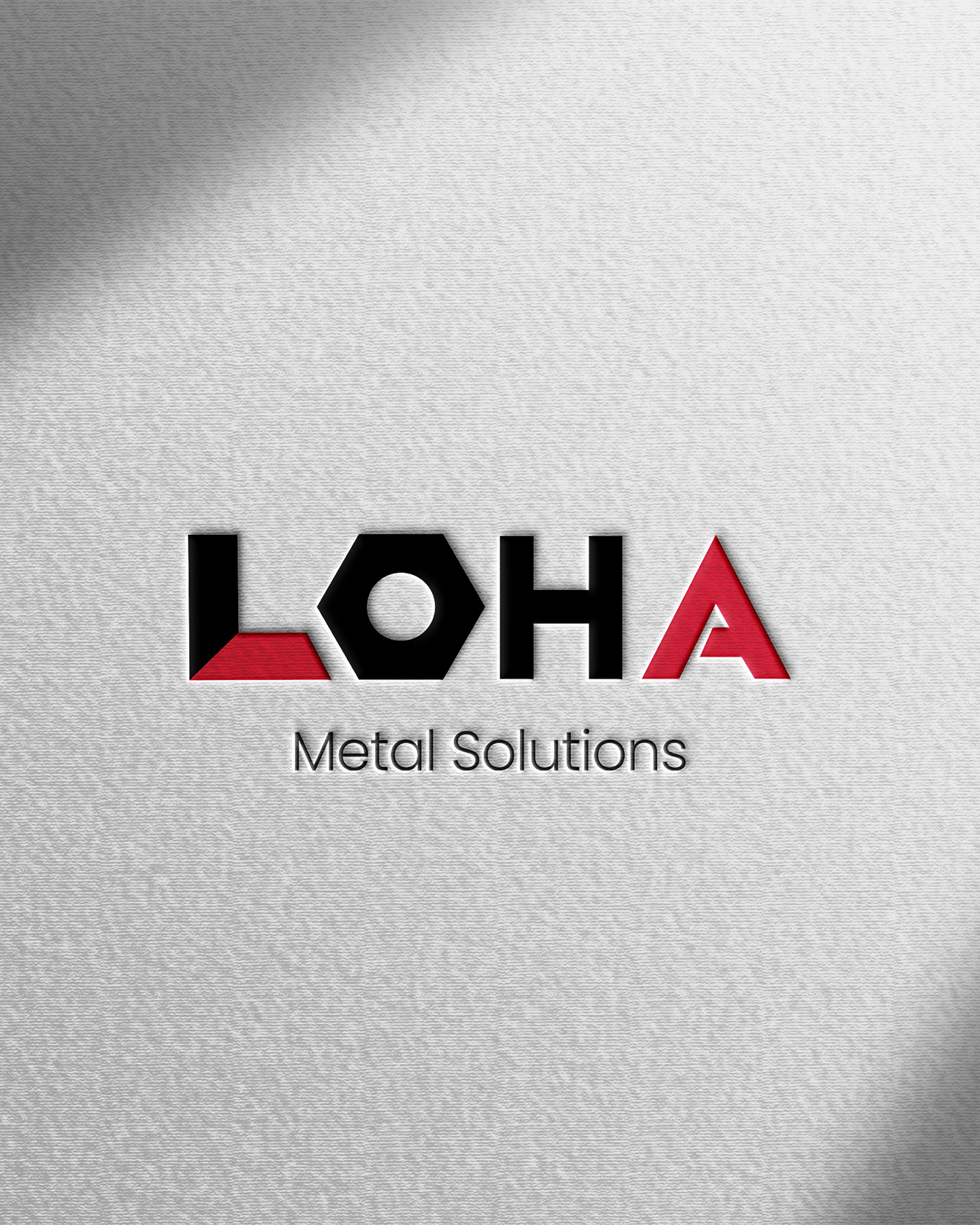
A powerful logotype and visual identity designed for LOHA Metal Solutions. The objective was to craft a bold, heavy-duty brand image that instantly communicates strength, industrial precision, and structural reliability.
Design Concept:
The identity relies on a custom-engineered wordmark. The letter 'O' has been cleverly replaced with a clean, geometric hex nut icon, establishing an immediate visual link to fabrication, engineering, and hardware. The sharp angles and structural cuts within the letters 'L' and 'A' mirror the precision of metalworking.
Color Palette & Typography:
A high-contrast palette of industrial black and a vivid metallic red was chosen to evoke strength, energy, and durability. The core brand name features a heavy, customized geometric display font, balanced perfectly by a clean, light sans-serif typeface for "Metal Solutions" to anchor the design.